
Color choices shape how a garden feels from the moment you step into it. The right pairings can turn a random collection of plants into something that feels designed and alive. Whether you prefer bold energy or quiet calm, understanding how colors interact gives you real control over the mood.
Some of the most successful combinations lean on contrast to create visual excitement. Purple and yellow sit opposite each other on the color wheel, so they naturally make each other pop without clashing. These bolder pairings tend to thrive in sunny spots where light intensifies their effect.
Other gardeners gravitate toward harmony rather than drama. Soft pinks layered with whites or pale blues create a sense of peace and flow, especially in shaded corners or evening gardens. These quieter palettes invite slower looking and tend to feel more romantic or restful.
Context matters as much as the colors themselves. A modern garden might call for restrained, architectural pairings like silver and deep burgundy, while a cottage style welcomes cheerful mixing.
Matching your palette to your setting ensures the whole space feels unified rather than forced.
Mood Comes Before Color
Every pairing on this list produces a distinct feeling, from the energy of complementary contrasts to the stillness of a single-hue planting. Decide whether you want a bed that draws attention from across the yard or one that rewards slow, close looking, since that choice narrows eighteen options down to three or four. The combinations below move from bold to quiet, so you can enter the list wherever your answer lands.
Purple and Yellow: The Classic Contrast That Pops
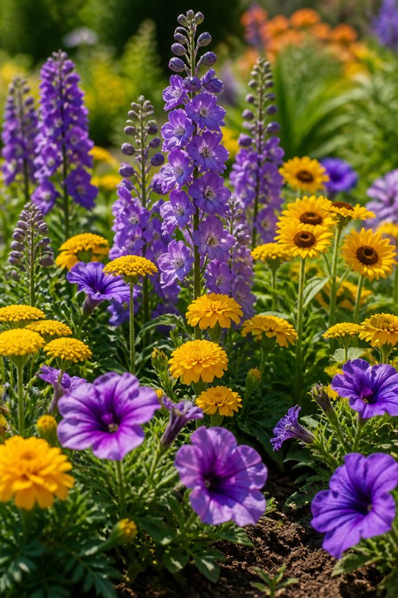
Purple and yellow sit directly across from each other on the color wheel, a placement that explains why the pairing creates such a strong visual effect in garden beds. This complementary relationship means each color intensifies the other, making both appear brighter than they would alone.
Gardeners often pair purple salvia with yellow coreopsis, or combine lavender with black-eyed Susans, to achieve this contrast on a smaller scale. Larger displays might use purple allium bulbs alongside yellow daylilies for height variation. The combination works in both formal and cottage-style gardens, since the contrast reads clearly from a distance while still holding interest up close.
Soil and light requirements should be checked before planting, as some purple and yellow varieties have different needs despite sharing similar bloom times.
Also read: 19 Small Garden Ideas on a Budget
Pink and White: The Soft Romantic Pairing
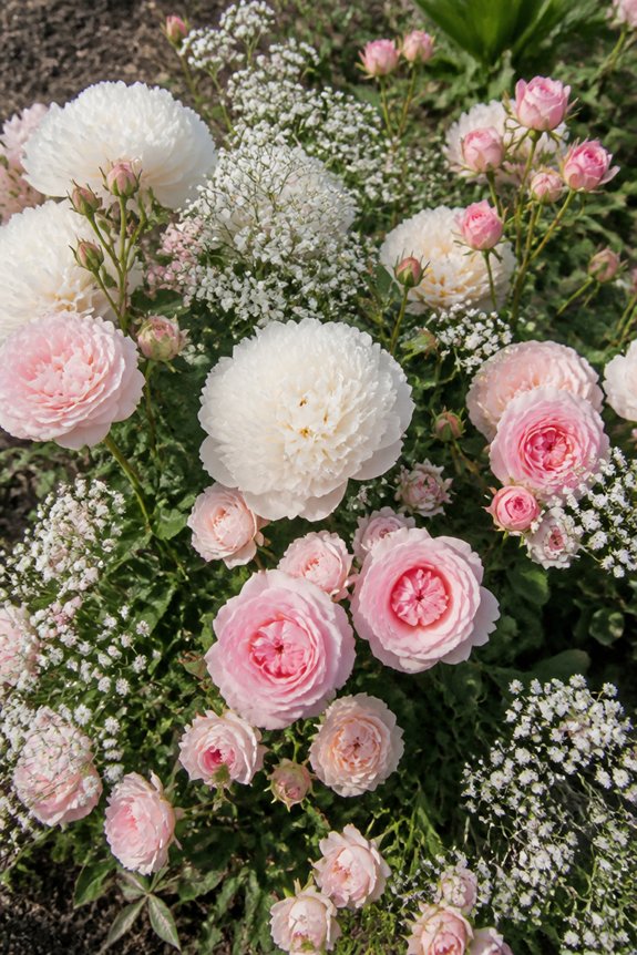
A softer approach to garden design, pink and white pairings rely on tone rather than contrast to create visual interest. This combination works well in romantic or cottage-style gardens, where gentle color gradients suggest calm rather than energy.
Pink roses paired with white peonies create a classic look, while pink cosmos mixed with white daisies offer a more casual, airy feel. Layering different shades of pink, from pale blush to deeper rose, alongside crisp white blooms adds depth without introducing visual clutter.
Plants like pink and white hydrangeas, impatiens, or dianthus support this palette across various garden styles. This pairing suits shaded borders, entryways, and bridal or memorial gardens, where a quiet, cohesive appearance is often preferred over bold statements.
Orange and Blue: A Bold Combination That Grabs Attention
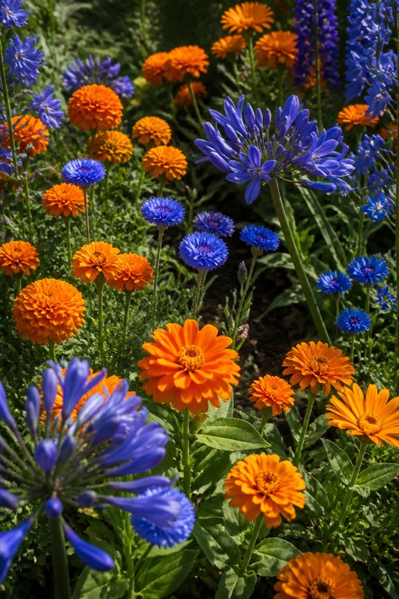
Contrast defines this pairing, since orange and blue sit opposite each other on the color wheel, creating a vivid, high-energy effect in garden beds. Marigolds, zinnias, and orange cosmos provide strong orange tones, while delphiniums, salvia, and blue hydrangeas supply the cooling counterpart. This combination works best when one color dominates and the other serves as an accent, preventing visual competition between equally strong hues.
Gardeners often use blue as a backdrop, with orange blooms placed in clusters to draw the eye toward focal points. Foliage plants with silvery or dark green leaves help separate the two colors, softening the shift. This pairing suits modern garden designs, borders, and containers where a striking, energetic look is the goal.
Red and Green: Bold Foliage for Vibrant Beds
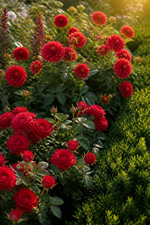
Two shades rarely need contrast from other hues, since red and green already form a natural pairing found throughout most gardens. Red flowers, such as roses, dahlias, and crocosmia, stand out clearly against the green backdrop of leaves and stems.
Gardeners can strengthen this pairing by choosing plants with darker or more colorful foliage, like coral bells or red-leaf hibiscus, which add depth without requiring extra blooms. Coleus varieties, with red and green patterned leaves, work well in shaded areas where flowering plants may struggle.
Repeating red accents throughout a bed, using both flowers and foliage, creates rhythm without overwhelming the space. This combination suits both formal and informal designs, offering flexibility for gardeners working with limited color palettes or seeking a classic, dependable look.
Blue and White: A Cool, Calming Combination
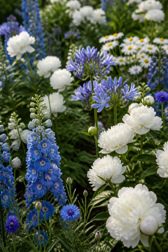
Where red and green rely on warmth and boldness, blue and white offer a quieter, more restful effect in the garden. Blue flowers, such as delphiniums, salvia, and bachelor’s buttons, bring a cool tone that pairs well with the crisp brightness of white blooms like daisies, alyssum, or white phlox.
Together, these colors create a calm, orderly appearance, often used in cottage gardens or formal borders. White helps highlight the blue shades, keeping the combination from feeling too dark or heavy. This pairing works well in shaded areas, where white flowers can reflect available light and blue tones stay soft rather than muted.
Gardeners often use this combination near patios or walkways, where a peaceful, cohesive look is preferred over bold contrast.
Pink and Purple: Layering Two Cottage Favorites
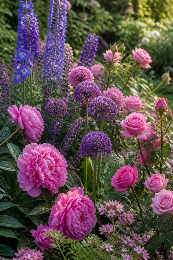
Because pink and purple share similar undertones, these two colors blend easily without competing for attention in a garden bed. Cottage gardens often rely on this pairing, using plants such as phlox, coneflowers, and asters to create layered depth.
Lighter pink varieties, like peonies or cosmos, soften the intensity of deeper purples found in salvia or verbena, producing a balanced visual effect. Placing taller purple plants toward the back and shorter pink ones in front adds dimension without overwhelming the space.
Repetition of these two colors throughout a bed helps unify mixed plantings, even when flower shapes and sizes vary. This combination works well in both formal borders and informal, natural-looking arrangements, offering flexibility across garden styles.
Yellow and Blue: The Cheerful Combo That Never Fades
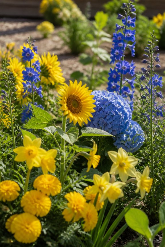
When contrasting colors sit opposite each other on the color wheel, they create a natural energy that gardeners often seek for high-impact beds. Yellow and blue occupy this relationship, making them a reliable pairing for borders, containers, and cutting gardens alike.
Black-eyed Susans, yellow yarrow, and coreopsis provide warm tones, while delphiniums, salvia, and cornflowers supply the cooler blue counterpart. This combination works across seasons, since many yellow and blue bloomers, including catmint and lemon daylilies, flower from early summer through fall.
Gardeners often use blue as a calming backdrop, allowing yellow flowers to stand out in the foreground. Repeating both colors throughout a bed, rather than clustering them separately, helps maintain visual balance and keeps the planting scheme cohesive over time.
Orange and Purple: A Rich, Jewel-Toned Pairing
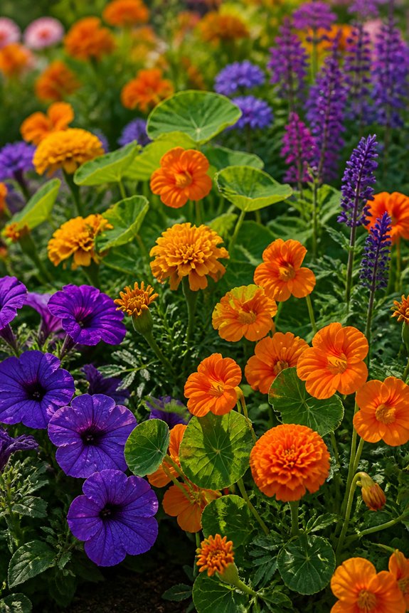
Adjacent placement on the color wheel gives orange and purple a different kind of visual tension than true opposites, producing a combination that reads as deep and saturated rather than sharply contrasting. This pairing works well for gardeners wanting a rich, jewel-toned effect rather than a bold clash.
Effective plant choices include orange cosmos or zinnias paired with purple salvia or verbena, deep purple clematis climbing near orange daylilies, and marigolds set against purple coneflower or allium.
Darker purples, such as eggplant or plum, intensify orange tones, while lighter lavender shades soften the pairing. Both colors carry warmth, so gardeners should add cooler greens or silvery foliage to prevent the bed from feeling overly heavy or dense in appearance.
White and Green: The Understated Designer Favorite
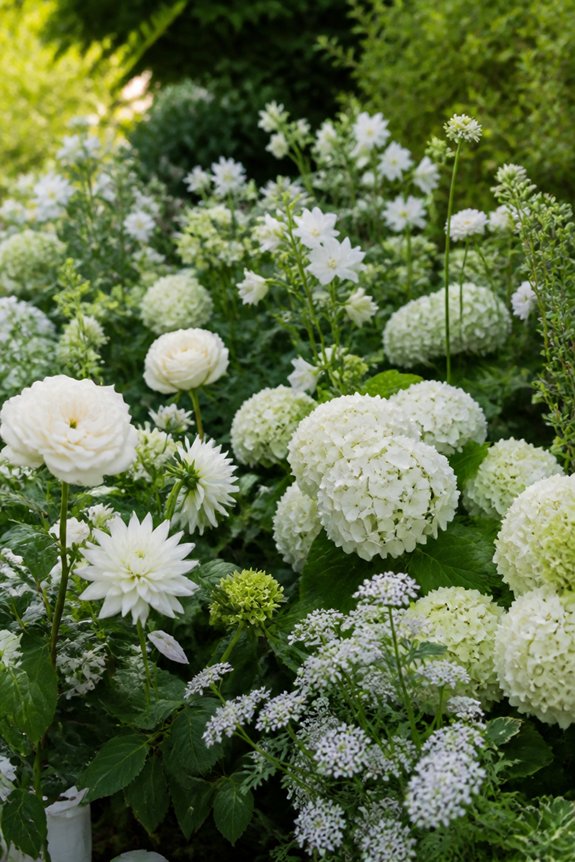
Since white and green appear in nearly every garden already, this pairing offers a foundation that designers often favor for its calm, versatile appearance. White flowers, such as shasta daisies, white hydrangeas, and moonflowers, stand out against green foliage, creating contrast without competing colors.
This combination works well in shaded areas, where brighter hues often fail to thrive, since white blooms reflect available light and appear luminous at dusk. Green itself contributes texture through varied leaf shapes, from the broad leaves of hostas to the fine, feathery foliage of ferns.
Gardeners often use this pairing in formal designs, moon gardens, or minimalist landscapes, where the goal is subtlety rather than boldness. White and green also pair easily with nearly any other color added later.
Red and Yellow: A Warm Combo for Sunny Borders
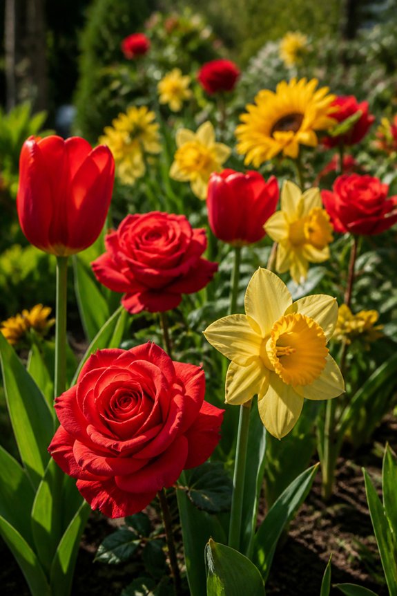
Moving from cooler, quieter palettes, red and yellow bring energy suited for sunny borders that receive direct light most of the day. This combination mirrors the intensity of summer sunlight, making it a natural choice for beds facing south or west.
Red zinnias, dahlias, or crocosmia pair well with yellow coreopsis, black-eyed Susans, or marigolds, creating contrast without clashing. Gardeners often balance the two colors by grouping them in clusters rather than mixing them randomly, which keeps the bed looking organized. Adding green foliage between clusters helps soften the shift between shades.
This pairing works best in informal or cottage-style gardens, where boldness is expected. Full sun exposure keeps both colors vibrant, while shade tends to dull their appearance over time.
Coral and Teal: A Fresh Twist on Tradition
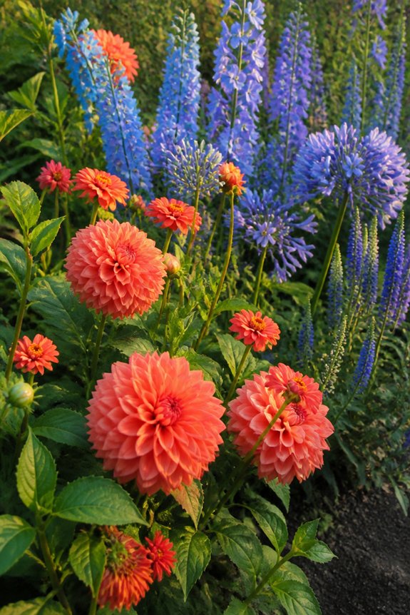
While red and yellow rely on contrast for impact, coral and teal offer a softer, more contemporary alternative that still catches attention. Coral brings warmth without the intensity of pure red, while teal adds a cool, blue-green depth that balances rather than clashes. This pairing works well in modern garden designs, where softer tones are preferred over bold primary colors.
Coral geraniums, zinnias, or begonias pair naturally with teal-toned foliage plants, such as certain hostas or ornamental grasses with blue-green hues. Container gardens benefit from this combination, since the colors remain visually interesting in smaller spaces.
Coastal-themed gardens often use coral and teal to echo beach palettes, incorporating shells or blue-painted pots as accents. This combination suits gardeners seeking a fresh, less traditional aesthetic.
Burgundy and Cream: Elegant Color for Formal Beds
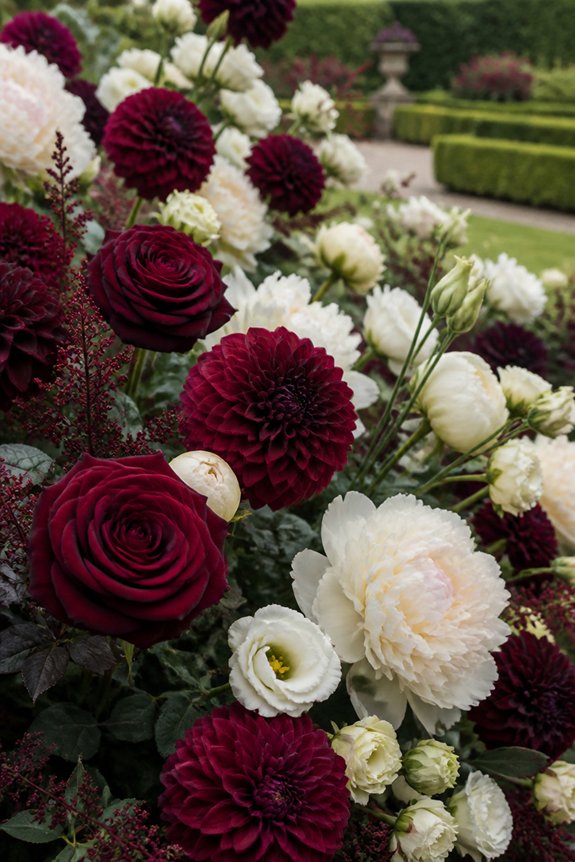
Formal garden beds often call for a refined palette, and burgundy paired with cream delivers exactly that kind of understated sophistication. Deep burgundy dahlias, or dark red roses, provide a strong visual anchor, while cream-colored flowers, such as pale roses or white foxglove with a soft ivory tint, soften the overall effect. This combination works well in symmetrical layouts, borders, and geometric beds, where structure matters as much as color.
Burgundy foliage, like that of certain heucheras, can extend the color theme beyond blooms alone, adding depth to the arrangement. Cream-toned edging plants, such as alyssum, help define bed boundaries clearly. This pairing suits estate gardens, formal entryways, and spaces where a controlled, elegant appearance is the primary goal.
Pink and Yellow: A Playful Cottage Garden Pairing
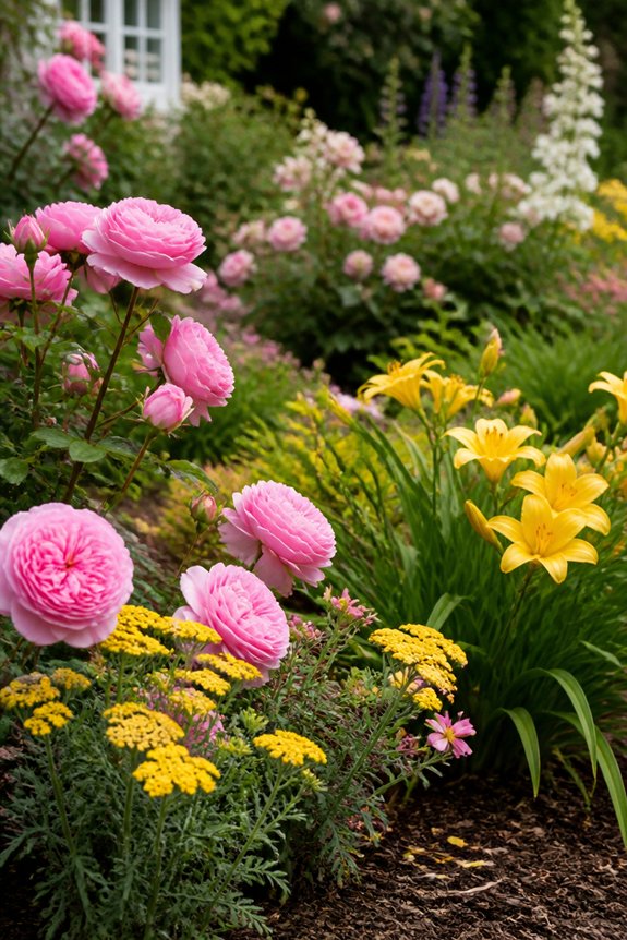
Cottage gardens thrive on a looser, more relaxed structure, and pink and yellow blooms bring a cheerful, informal energy to these spaces. This pairing works well because pink softens yellow’s boldness, while yellow adds brightness to pink’s sweetness, creating a balance that feels natural rather than forced.
Roses in soft pink pair nicely with yellow yarrow or coreopsis, while pink cosmos mix easily with black-eyed Susans for a wildflower look. Foxglove and yellow daylilies add height and variation, keeping the bed from feeling flat. Repetition of both colors throughout the garden, rather than isolated clusters, helps unify the design.
This combination suits informal borders, mixed perennial beds, and gardens meant to attract pollinators, since many pink and yellow flowers, including coneflowers and marigolds, draw bees and butterflies effectively.
Lavender and Silver: A Dreamy, Moonlit Look
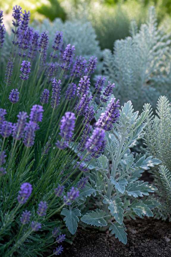
A garden built around lavender and silver tones creates a soft, glowing effect, especially in early morning or evening light. Plants like English lavender, Russian sage, and catmint provide the purple hues, while lamb’s ear, artemisia, and dusty miller supply the silvery foliage that brightens the palette.
This combination works well in gardens meant for evening viewing, since the silver leaves reflect available light and appear almost luminous after sunset. Both plant groups tend to favor dry, well-drained soil and full sun, making them practical companions regarding care.
Gardeners often use this pairing along walkways or near seating areas, where the muted colors and fragrant foliage can be appreciated up close, particularly during summer months.
Peach and Sage: A Soft, Modern Combination
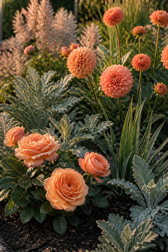
When peach and sage green appear together, the result reads as understated and contemporary rather than traditional. Peach carries warmth without the intensity of orange, while sage offers a muted, grayish green that softens contrast.
This pairing works well in modern garden designs, cottage borders, and container arrangements alike. Peach roses, dahlias, or zinnias combine effectively with sage-toned foliage plants like artemisia, lamb’s ear, or eucalyptus. Ornamental grasses in soft green tones can extend the palette further.
The combination suits gardens aiming for a relaxed, tonal look rather than bold contrast. Peach and sage also pair naturally with neutral tones like cream or ivory, allowing for flexible layering. This scheme photographs well in natural light, making it popular for garden displays near patios or entryways.
All-White Gardens: A Monochrome Classic
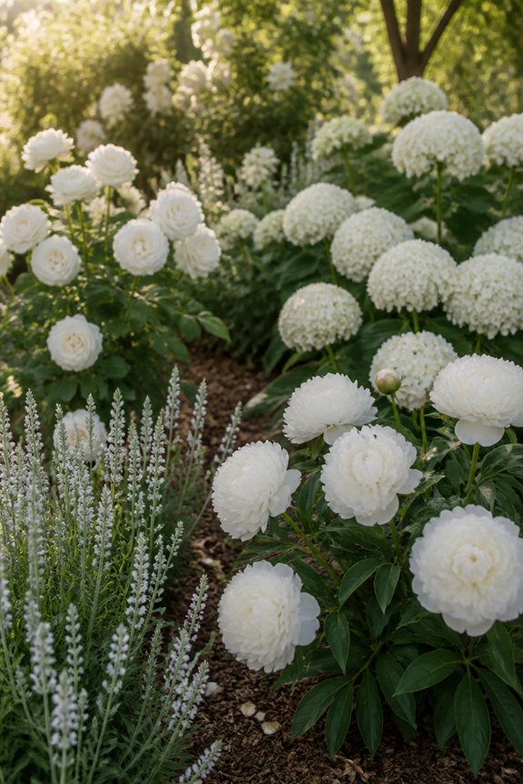
Moving from soft tonal pairings to a single-color approach, all-white gardens represent one of the most enduring design choices in garden history. This style relies on contrast in texture, form, and foliage rather than color variation, creating visual interest through shape alone.
Popular white-flowering plants include white hydrangeas, shasta daisies, white roses, and Queen Anne’s lace, each offering different petal structures and heights. Gardeners often layer plants with silver or gray-green foliage, such as lamb’s ear or dusty miller, to add subtle depth without introducing new hues.
White gardens tend to appear brighter at dusk and under moonlight, making them practical choices for evening spaces or areas near patios. This restrained palette suits formal landscapes, cottage gardens, and modern minimalist designs equally well, offering flexibility across different architectural styles and settings.
Rainbow Meadows: Mixing Colors Successfully
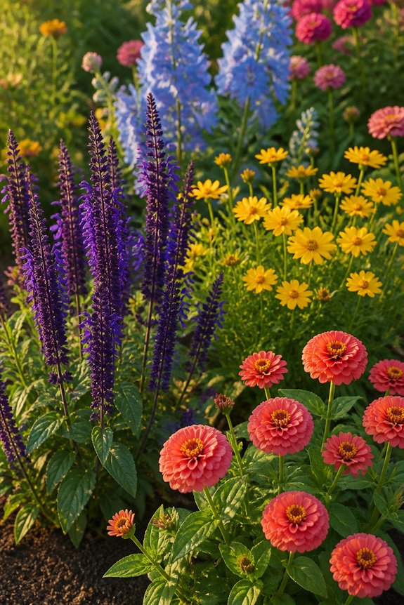
Because too many colors can create visual chaos rather than charm, successful multicolor gardens rely on structure to guide the eye. Repetition serves as an anchor, so gardeners often repeat three or four key colors throughout the bed, using varieties like zinnias, cosmos, and black-eyed Susans to echo those tones across different sections.
A neutral base, such as green foliage or white blooms, helps separate bright colors from clashing with one another. Grouping flowers in odd-numbered clusters, rather than scattering single stems, creates rhythm without appearing random. Color wheel pairings, such as purple and yellow or orange and blue, provide contrast while maintaining balance.
Height variation also matters, since taller plants like sunflowers can anchor shorter, colorful borders like marigolds or petunias.
Garden Style and Flower Color: Finding Your Match
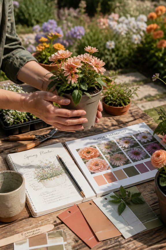
How does a garden’s overall design influence which color palette will work best? Formal gardens, with their symmetrical layouts and clipped hedges, pair well with restrained color schemes, such as white and green or single-hue plantings. Cottage gardens, by contrast, thrive on abundance, allowing pinks, purples, yellows, and blues to mix freely without strict rules. Modern minimalist gardens often rely on bold contrast, pairing one dominant color, like deep purple, against neutral foliage.
Woodland gardens suit soft, muted tones, including pale blue, lavender, and cream, which echo natural shade conditions. Matching color choices to garden style, rather than choosing flowers in isolation, creates cohesion between structure, plant selection, and overall visual impact throughout the space.
Frequently Asked Questions
How Do I Choose Flower Colors That Suit My Home’s Exterior?
Choosing flower colors that complement a home’s exterior involves matching or contrasting with siding, trim, and brick tones. Neutral exteriors pair well with bold blooms, while colorful facades benefit from softer, harmonious shades nearby.
Can Color Combinations Affect How Large a Garden Feels?
Yes—like Monet’s illusion-filled Giverny, color manipulates perceived space. Cool blues and violets recede, suggesting depth, while hot reds and oranges advance, creating intimacy. Gardeners exploit this optical trick to make small plots feel expansive or grand spaces feel cozy.
What Flower Colors Attract the Most Pollinators to My Garden?
Blue, purple, and yellow blooms attract the most pollinators, as bees see these hues vividly. Butterflies favor red, orange, and pink flowers. Combining these colors throughout a garden encourages diverse pollinator activity, supporting healthier plant reproduction and abundant blooming cycles.
How Do I Maintain Color Combinations Across Changing Seasons?
Like a painter rotating canvases with the sun’s arc, gardeners layer bloom times strategically—spring bulbs handing color batons to summer perennials, then autumn foliage—ensuring chosen palettes reappear continuously through succession planting and overlapping bloom cycles.
Should Color Choices Differ for Shaded Versus Sunny Garden Areas?
Yes. Shaded areas favor whites, pale yellows, and soft pastels that brighten low light, while sunny spots handle bold reds, oranges, and deep purples well, since strong sunlight intensifies vibrant hues without washing them out.
Conclusion
Choosing flower garden color combinations depends on personal preference, garden style, and desired mood. Classic pairings like purple and yellow or pink and white offer timeless appeal, while modern options such as peach and sage or coral and teal suit contemporary landscapes. Gardeners can experiment with bold contrasts or calming tones, much like a medieval scribe updating an ancient manuscript with a laser printer, blending tradition with innovation. Ultimately, successful color planning creates a garden that remains visually balanced and appealing throughout the growing season.